AUM® — DESIGNING ONE PRODUCT FOR TEN AI TOOLS
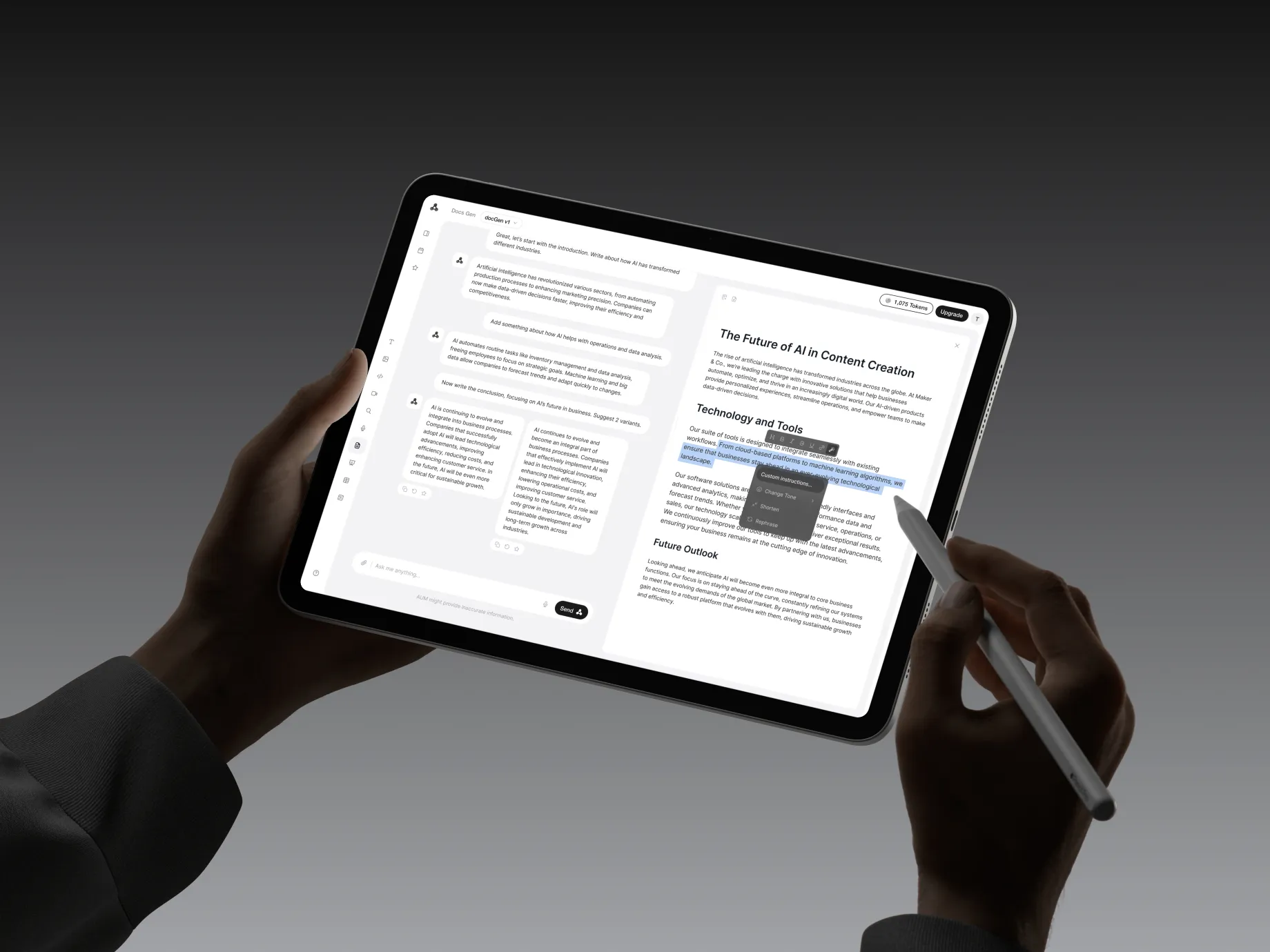
The founder came to me with written descriptions of ten AI tools and no existing product. As the sole designer, I was responsible for turning that brief into a structure people could navigate and work in: text, images, video, code, math, documents, search, speech, presentations, and spreadsheets.
I worked directly with the founder, defining the interaction model and designing the product across desktop, key mobile screens, light and dark themes, and account flows.
The designed product
Ten tools within a shared interface, with different working areas for conversations, generated media, editing, and voice.
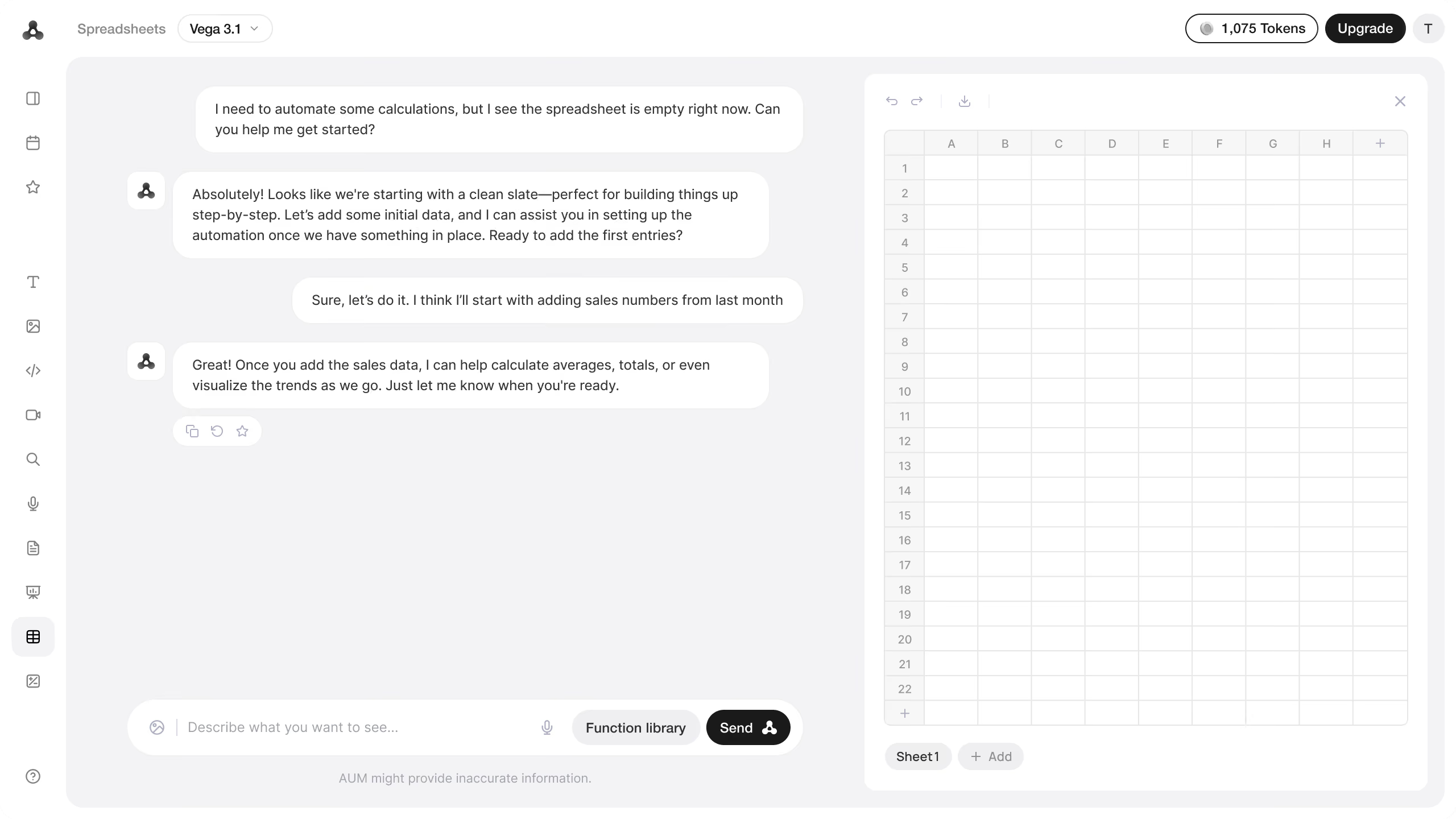
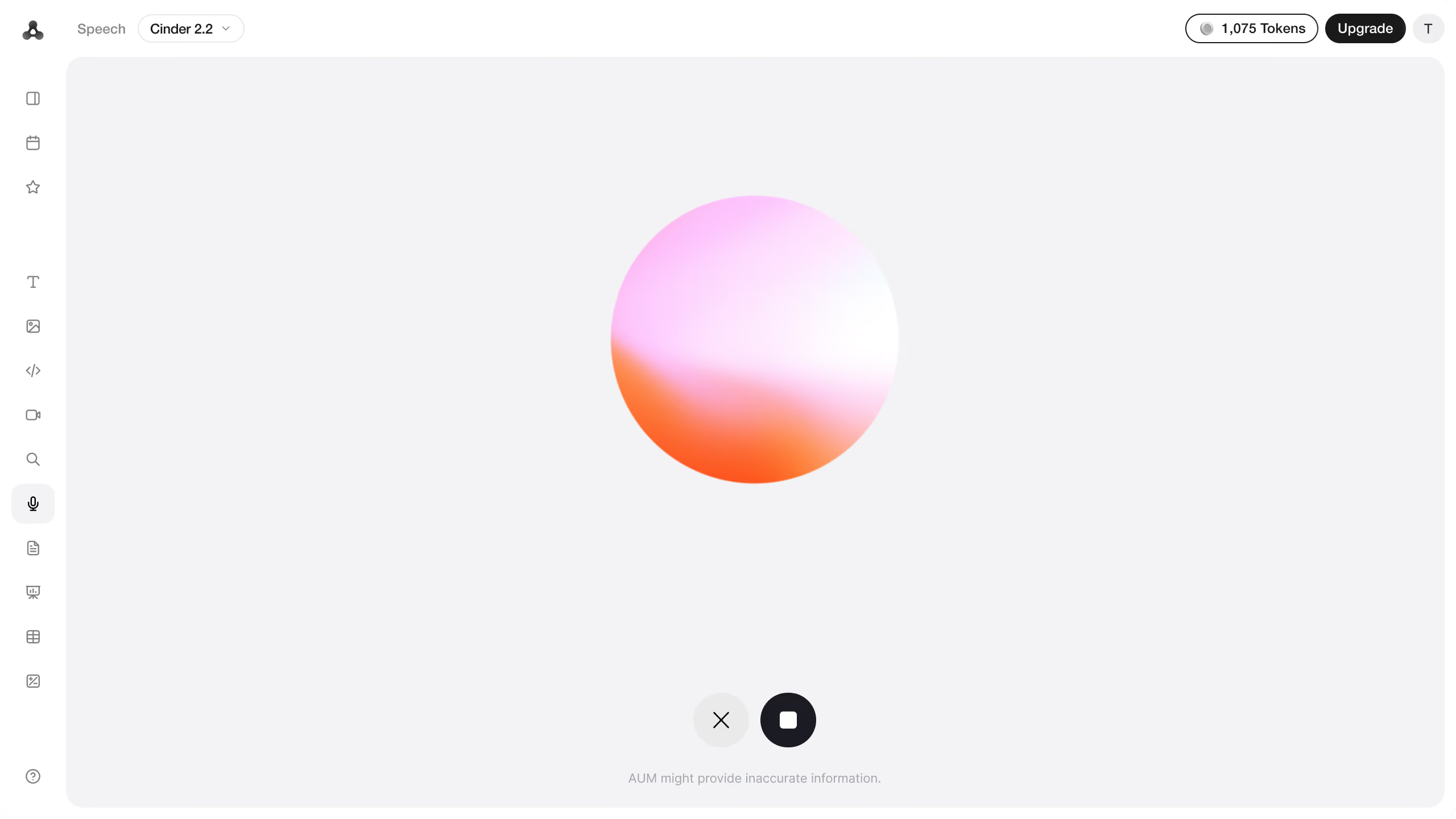
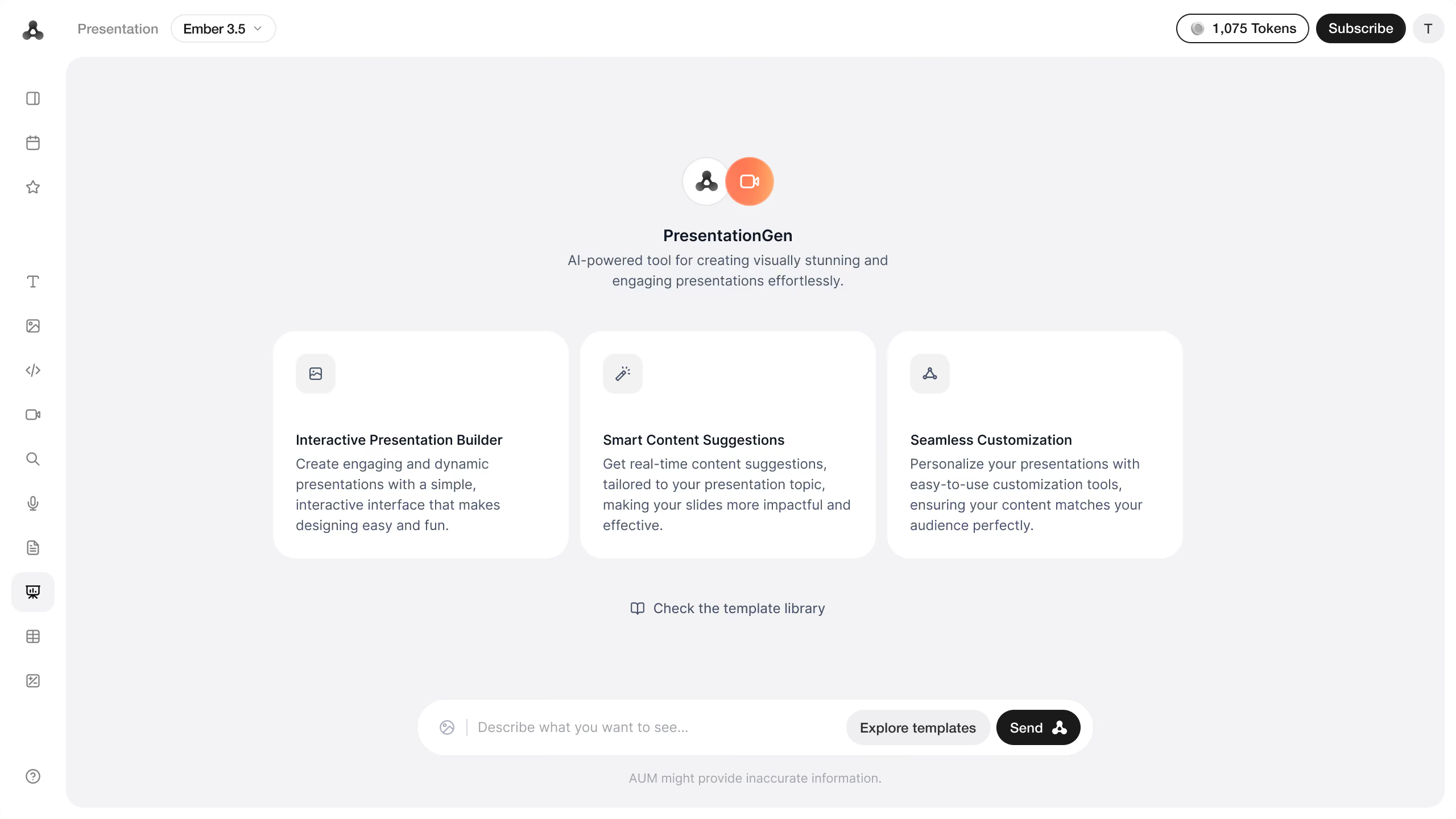
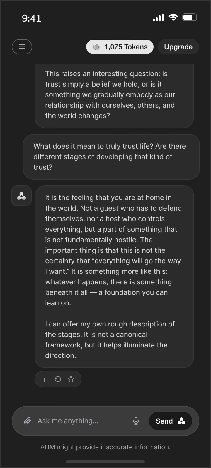
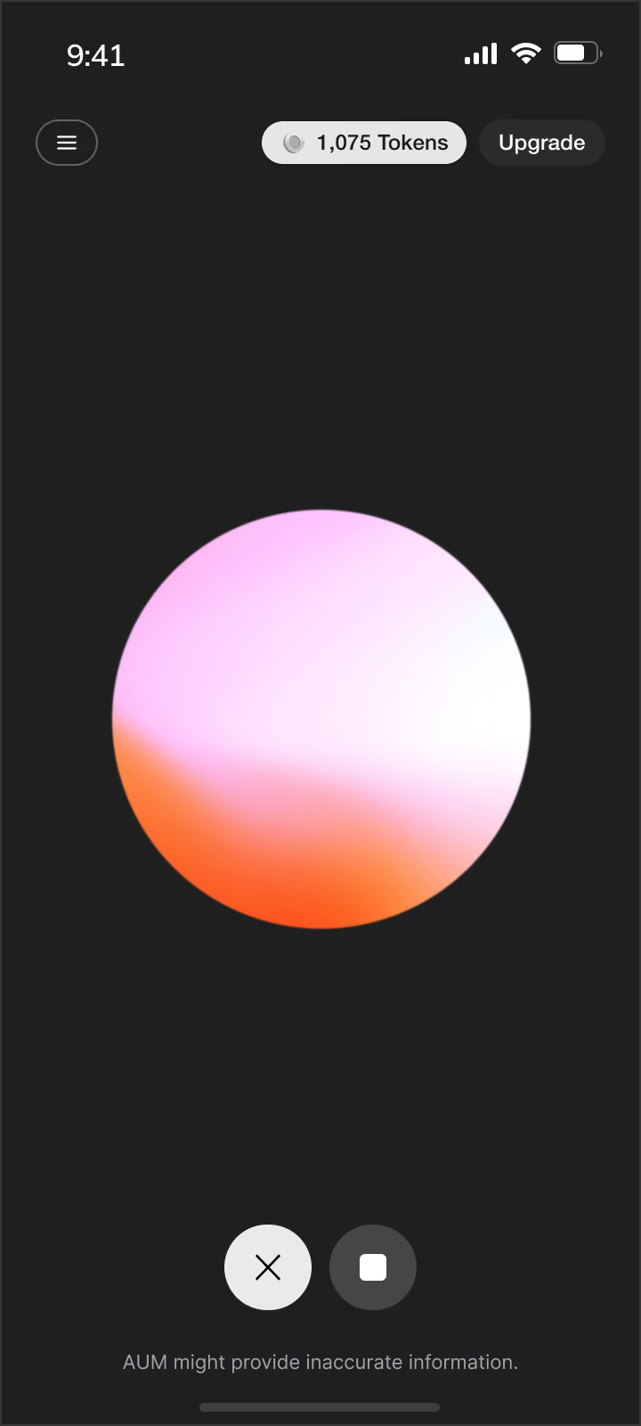

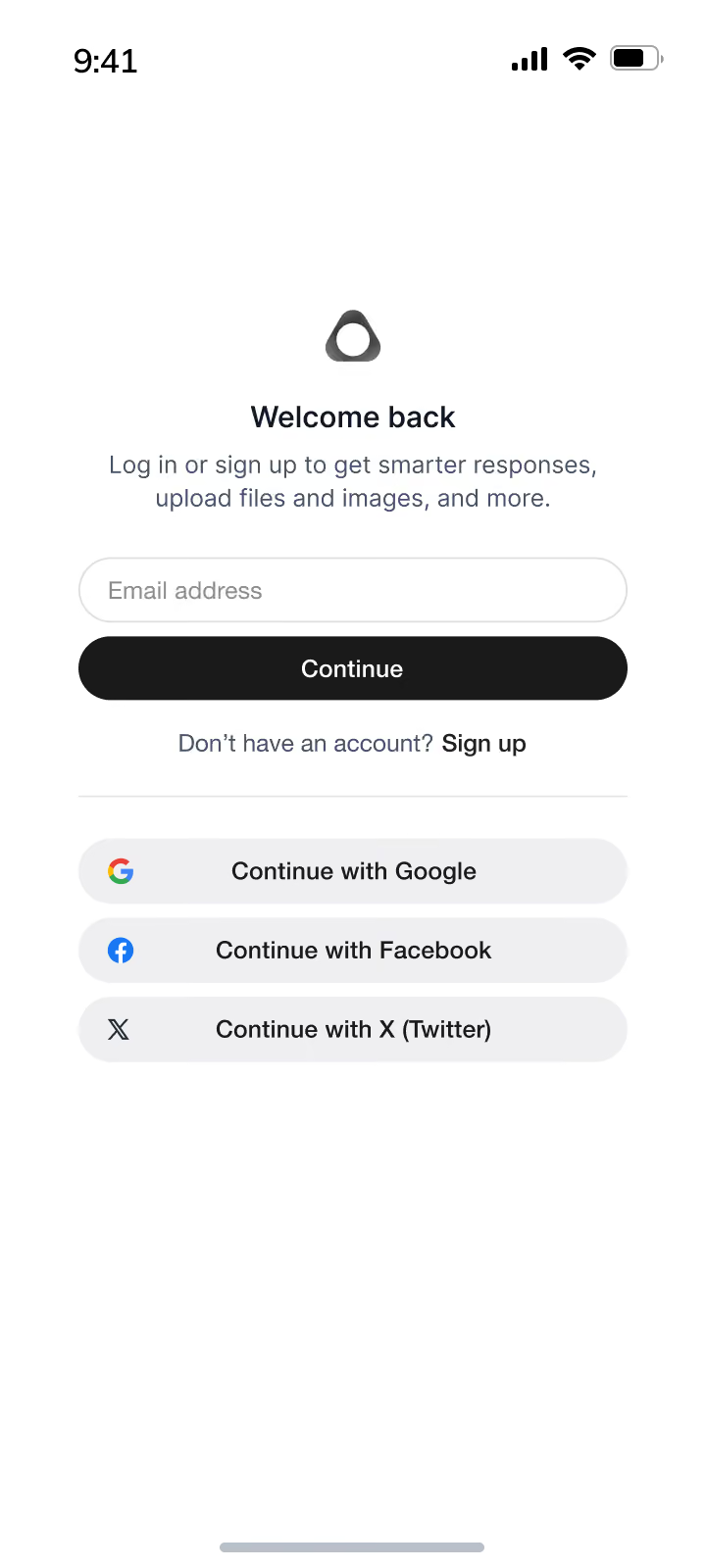
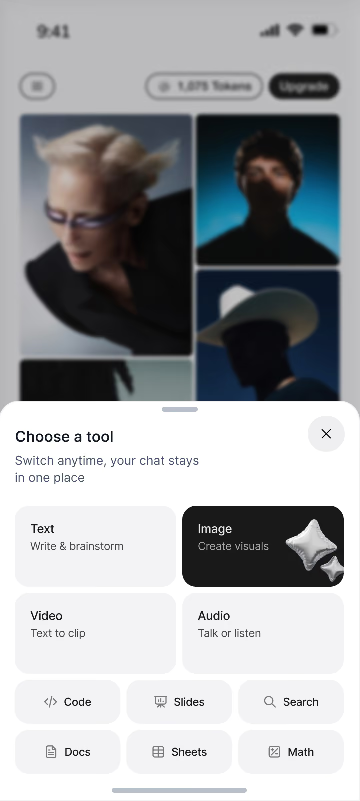
Ten tools described the scope. Their tasks shaped the structure.
The brief identified what AUM should offer, but left the interaction model open. I needed to determine how people would move from asking for something to working with the result, and which parts of that process could be shared across tools.
I approached the tools through their tasks: entering a request, reviewing an answer, choosing a result, and continuing to edit it. That revealed where one layout could serve several tools and where a dedicated working area was necessary. A document and an image need different controls, but both may need to remain visible while someone gives further instructions.
Decide what stays consistent and what needs to change
I kept navigation, account controls, and the position of the model selector consistent across the product. These formed the stable structure around each tool. Inside it, I allowed the layout, input options, and actions to change with the task.
This set a boundary for reuse. Shared elements could be designed together, while a spreadsheet could still behave like a spreadsheet and an image tool could provide visual editing controls. Consistency came from the surrounding structure and placement of common actions.
Three ways to organize the work
I proposed three layouts based on how much space a task needed and whether someone was working on one output or two separate tasks.
I did not extend split view to code, documents, presentations, or spreadsheets. Their conversation and working area already occupied both sides of the screen. Supporting another task would introduce more panes and reduce the space available for editing. I chose to preserve that space and limit the available combinations.
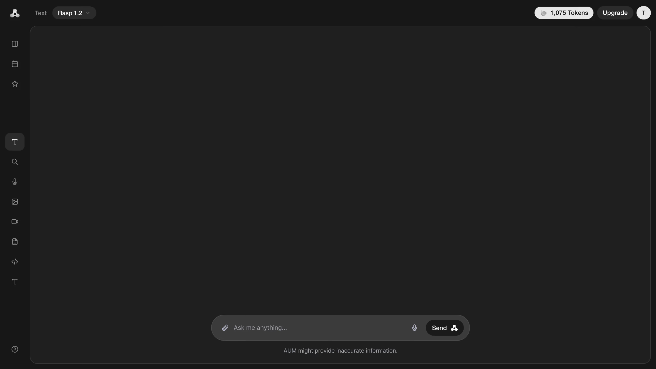
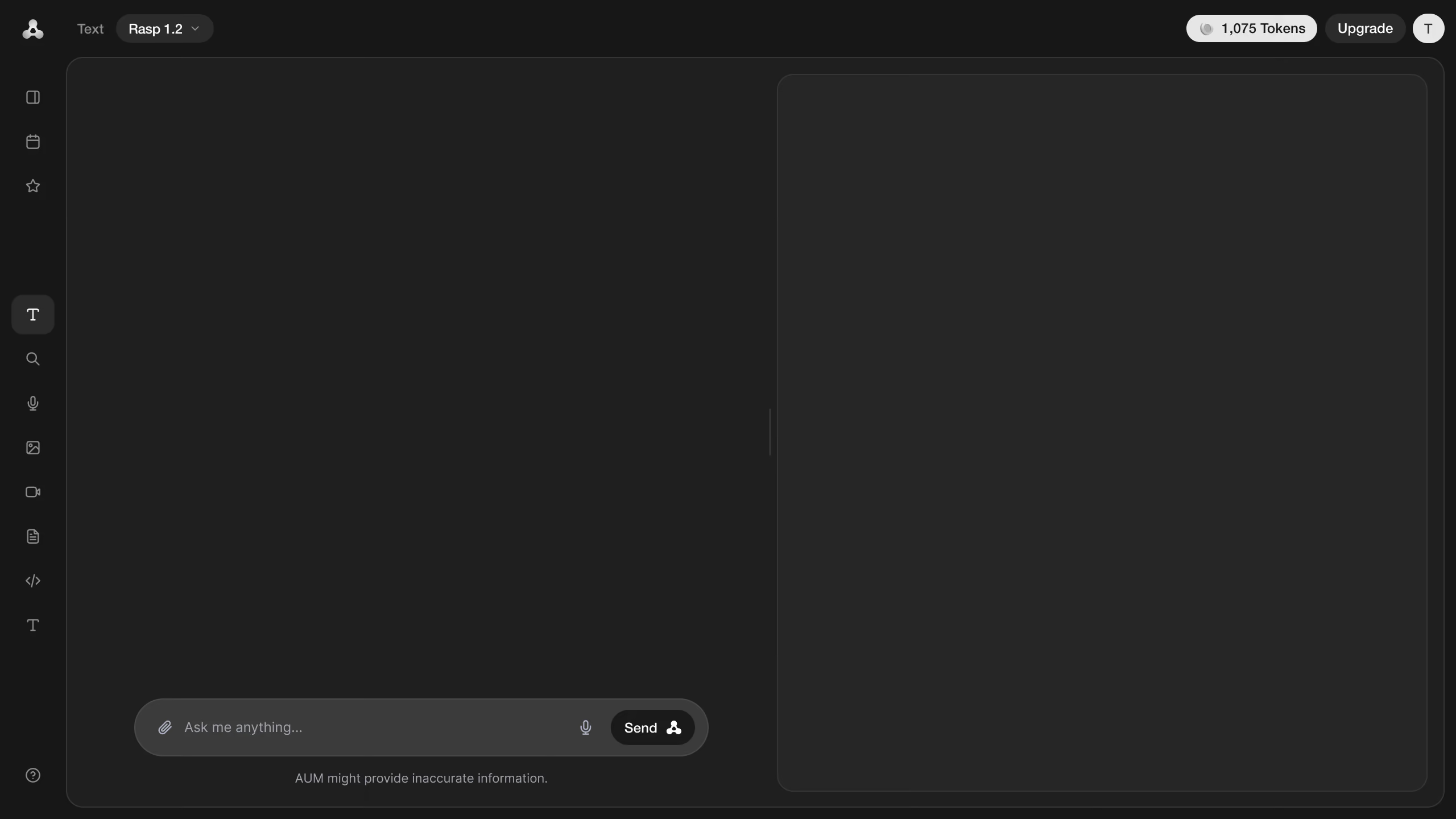
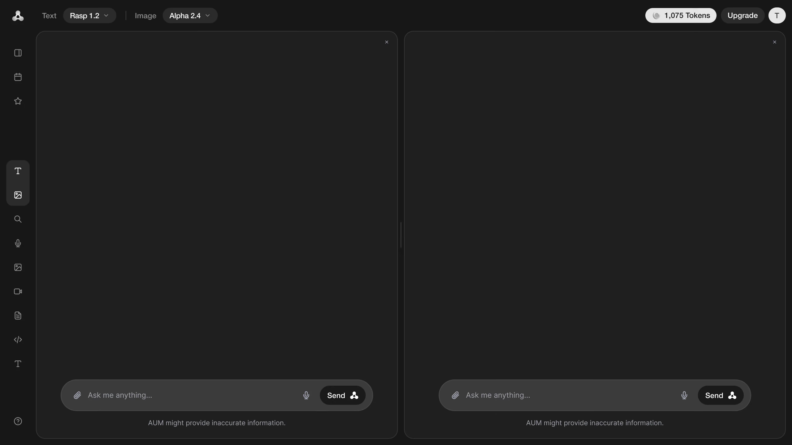
— Single view: keep one task in focus
One tool uses the main area for a conversation or generated results. This provides the most space for reading and reviewing when a separate editor is unnecessary.
— Split view: make parallel work possible
Two tasks sit side by side, each with its own input. I proposed this mode so someone could work on both without repeatedly switching between them. The trade-off is width: each task has less room, which limits the kinds of work the layout can support.
— Workspace view: keep instructions and output together
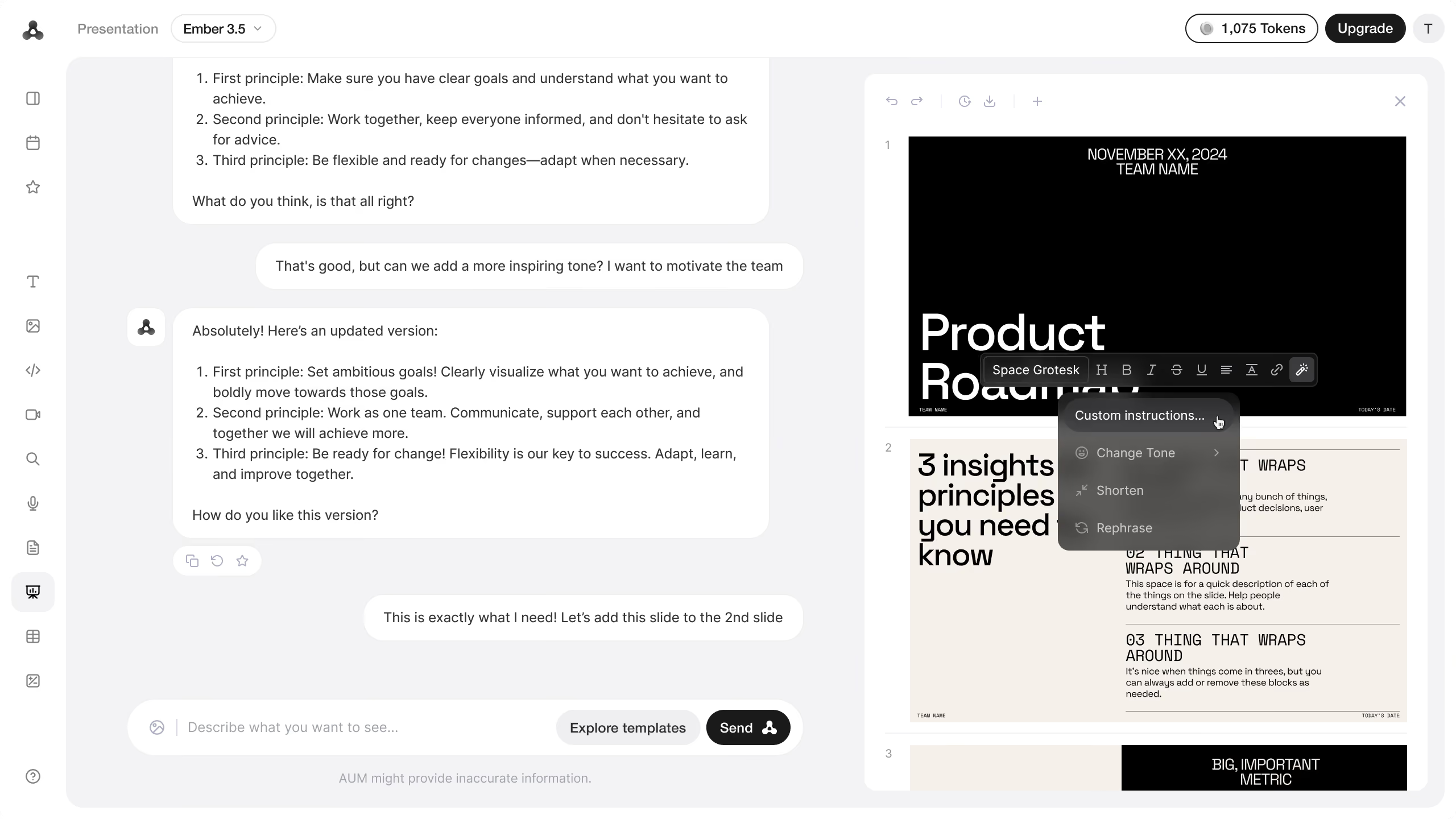
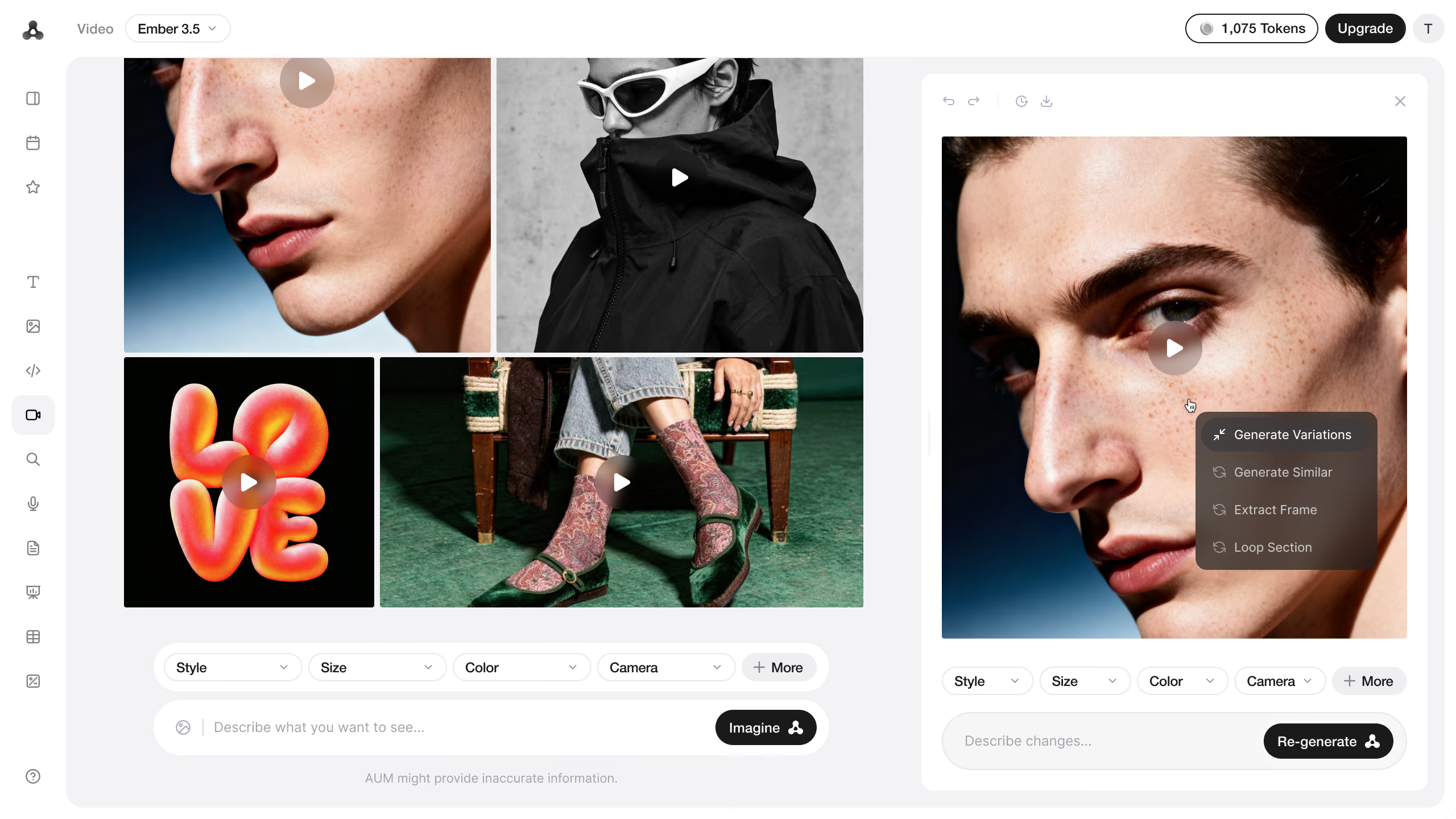
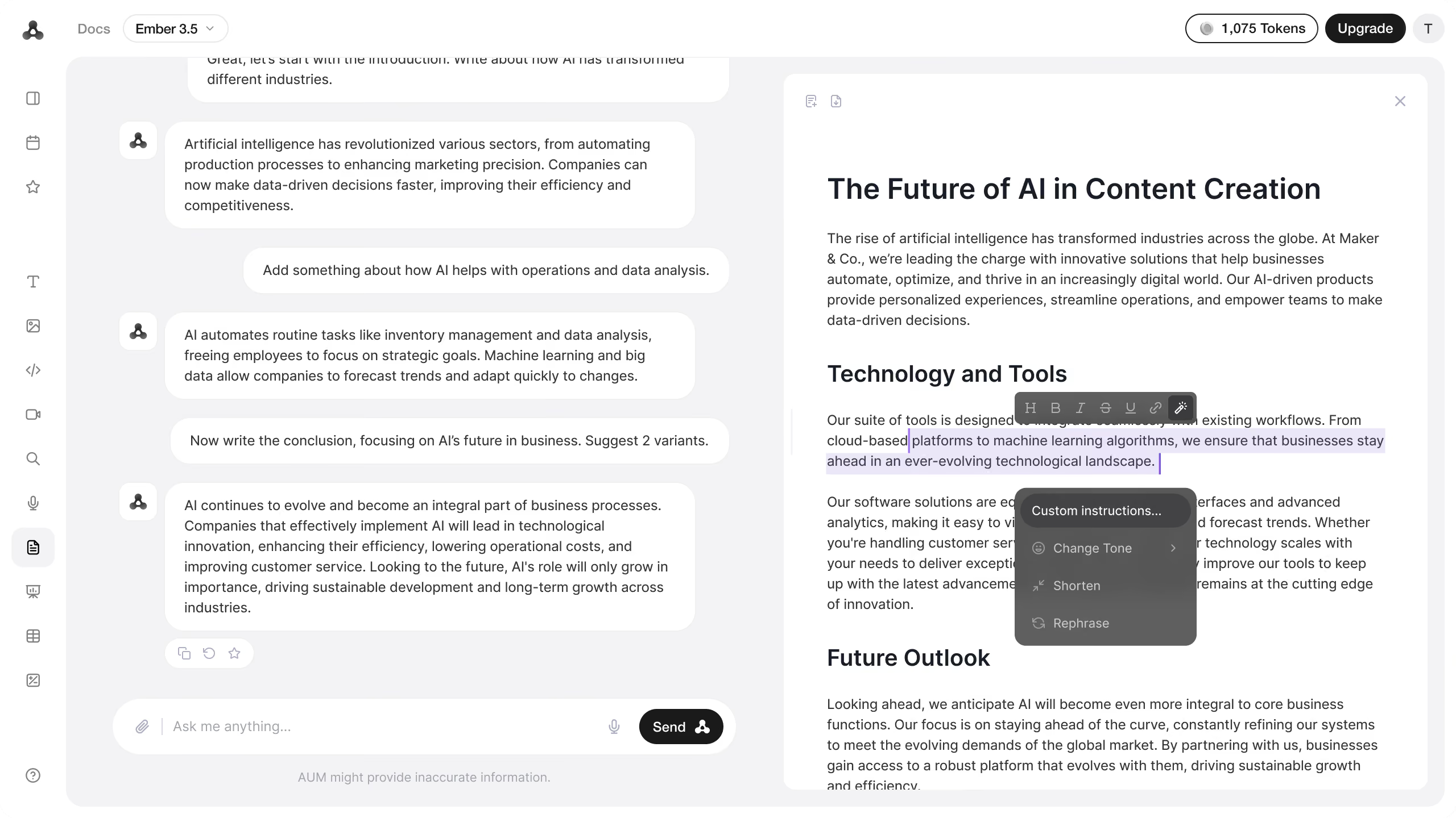
A conversation or collection of results sits beside a dedicated working area. This supports tasks where the output needs continued attention: editing a document, inspecting code, working with cells, or refining selected media.
Extend the task without rebuilding the surrounding interface
Some tools gained additional requirements during the project. As they expanded, I considered whether the new action could stay within the existing view or needed a working area of its own. The workspace layout provided a way to accommodate more involved tasks while retaining the surrounding navigation and controls.
The detailed actions remained specific to each output. A document supports edits to selected passages; an image offers variations and background changes; a video offers actions such as extracting a frame or looping a section. I placed those controls near the result they affect, using the shared layout to organize them.
Carry the structure beyond the main tools
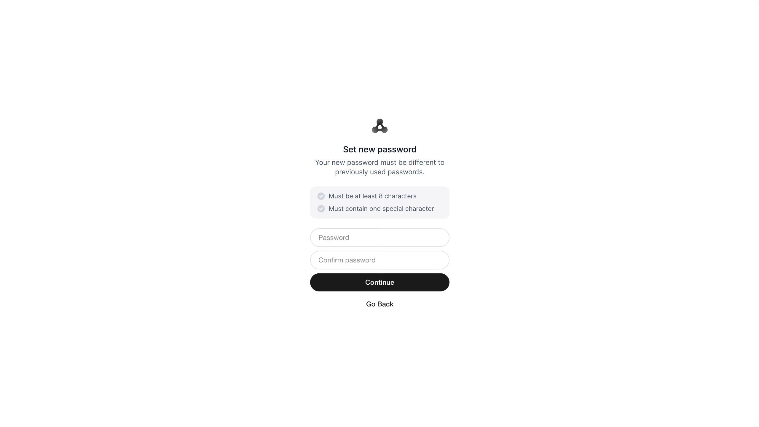
The scope also included sign-up, login, verification, password reset, light and dark themes, and key mobile screens. These extended the same visual language into entering the product, managing access, and using selected parts of it on a smaller screen.
A product design built from an open brief
I delivered the designs for all ten tools and the shared layouts and components supporting them. My scope ended at design handoff; I do not have evidence of how the product performed after delivery.
The central decision was where to draw the boundary between shared structure and tool-specific behavior. Three layouts made that boundary explicit, but their usability still needed validation. The next step would be to test transitions between tools and modes, particularly whether split view provides enough working space and whether people understand when to open a dedicated workspace.