STORYKEEP® — INCREASING SIGNUP COMPLETION FROM 12% TO 25%
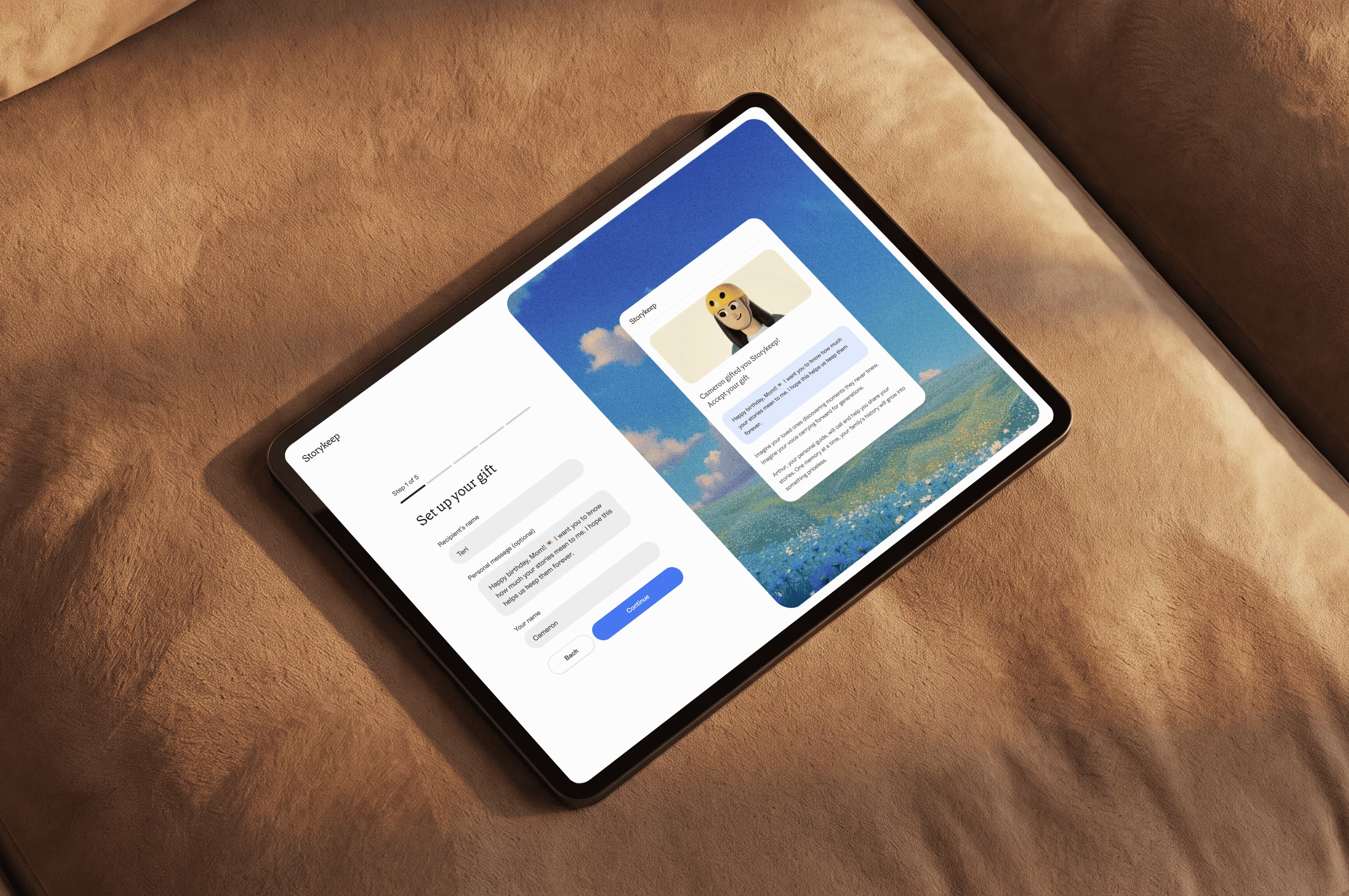
Arthur is Storykeep’s AI interviewer. He calls each week, asks about childhood, work and everyday memories, and remembers previous conversations. Over time, those calls become a biography for family and friends to read.
People could sign up to record their own stories or give Storykeep to someone else. Both paths already existed, along with the platform and a UI kit.
This was my first task at the company. Paid traffic was reaching registration, but too many people were leaving before completing it.
The redesigned experience
Two paths, shaped around different intentions: setting up your own storytelling experience or preparing a gift for someone else.
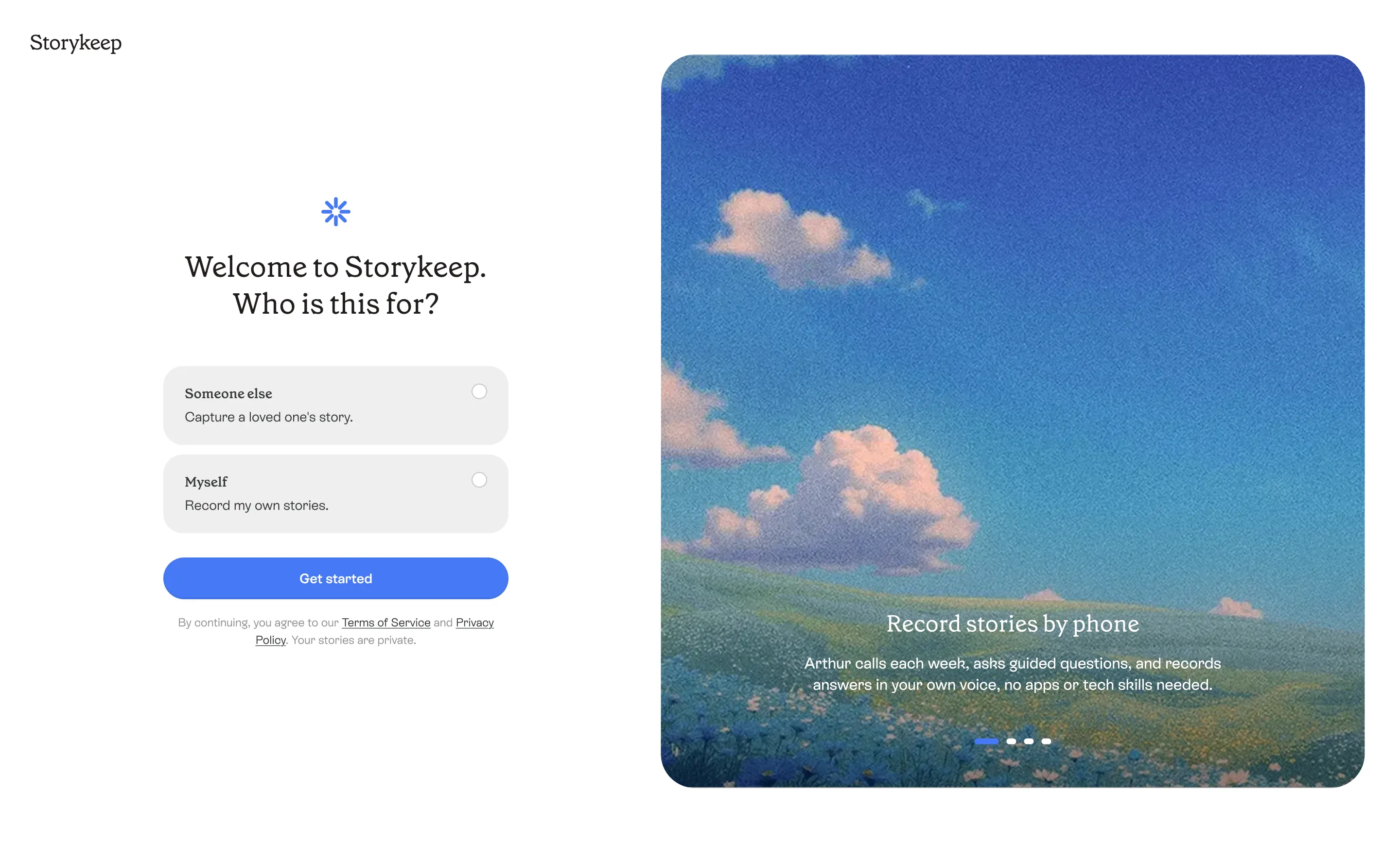
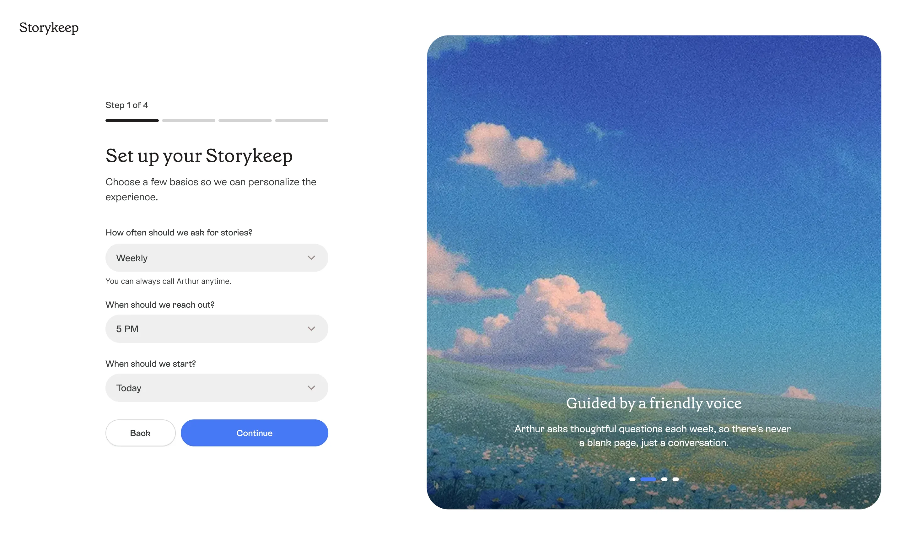
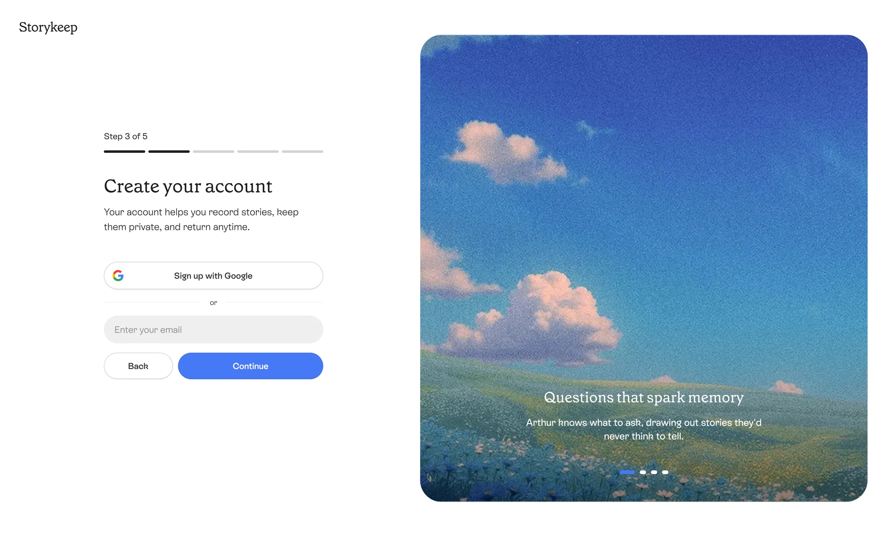
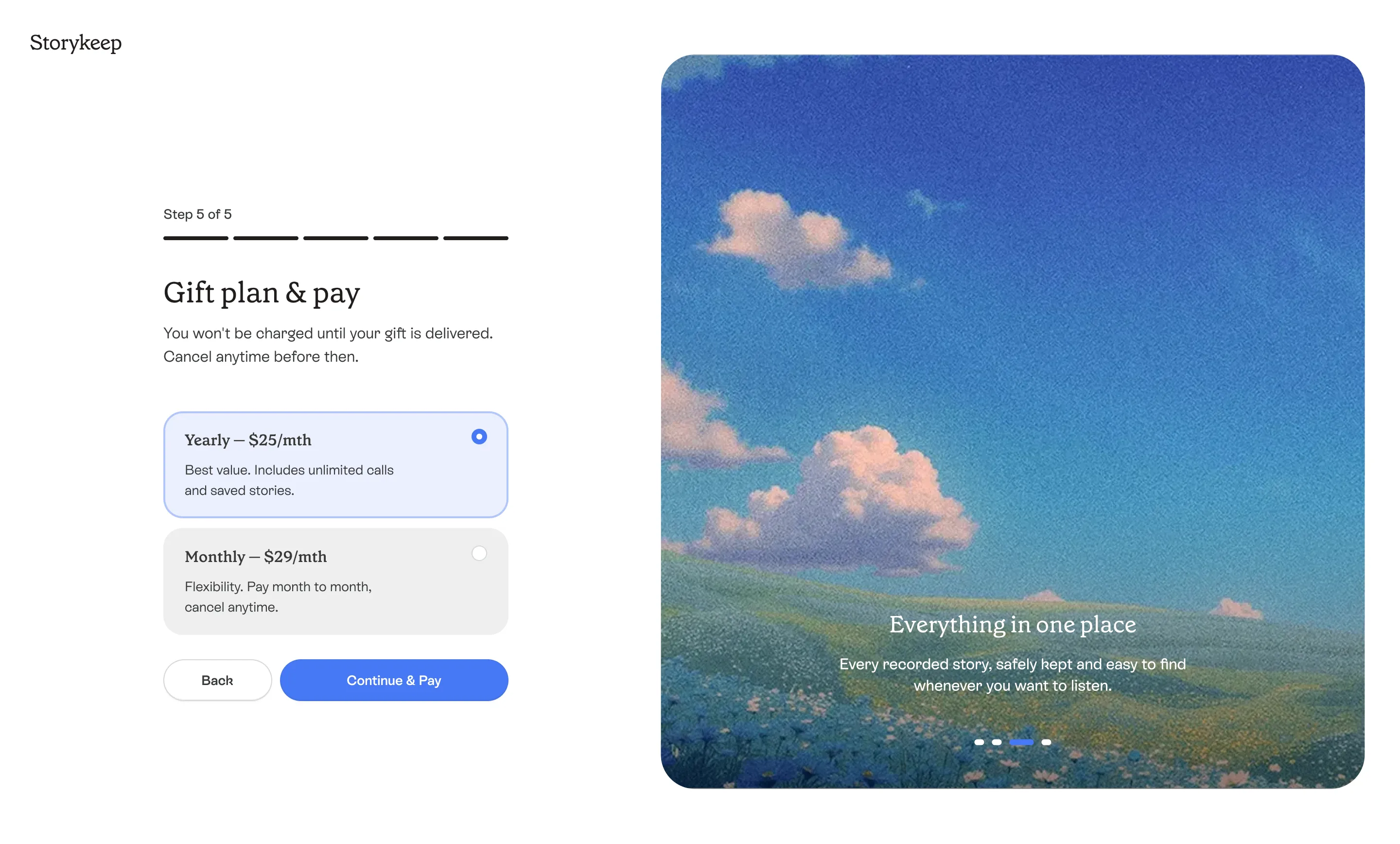
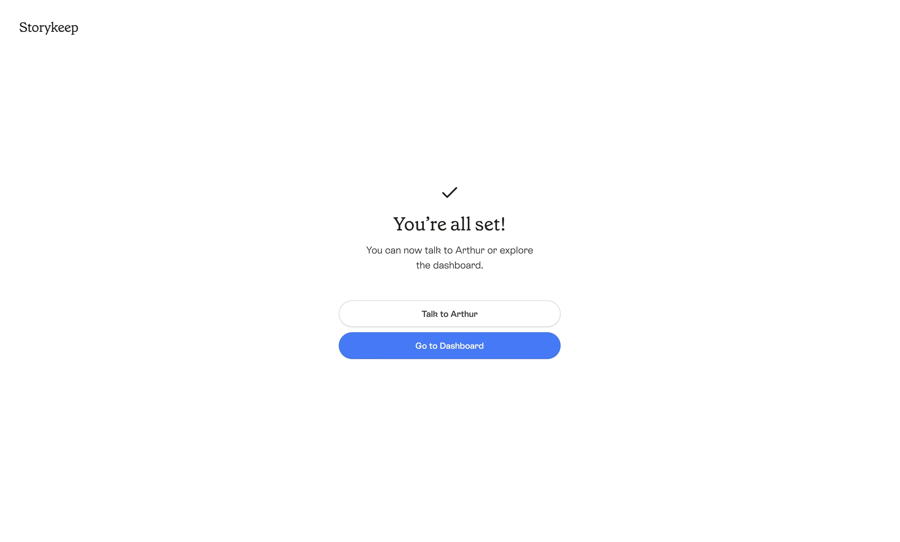
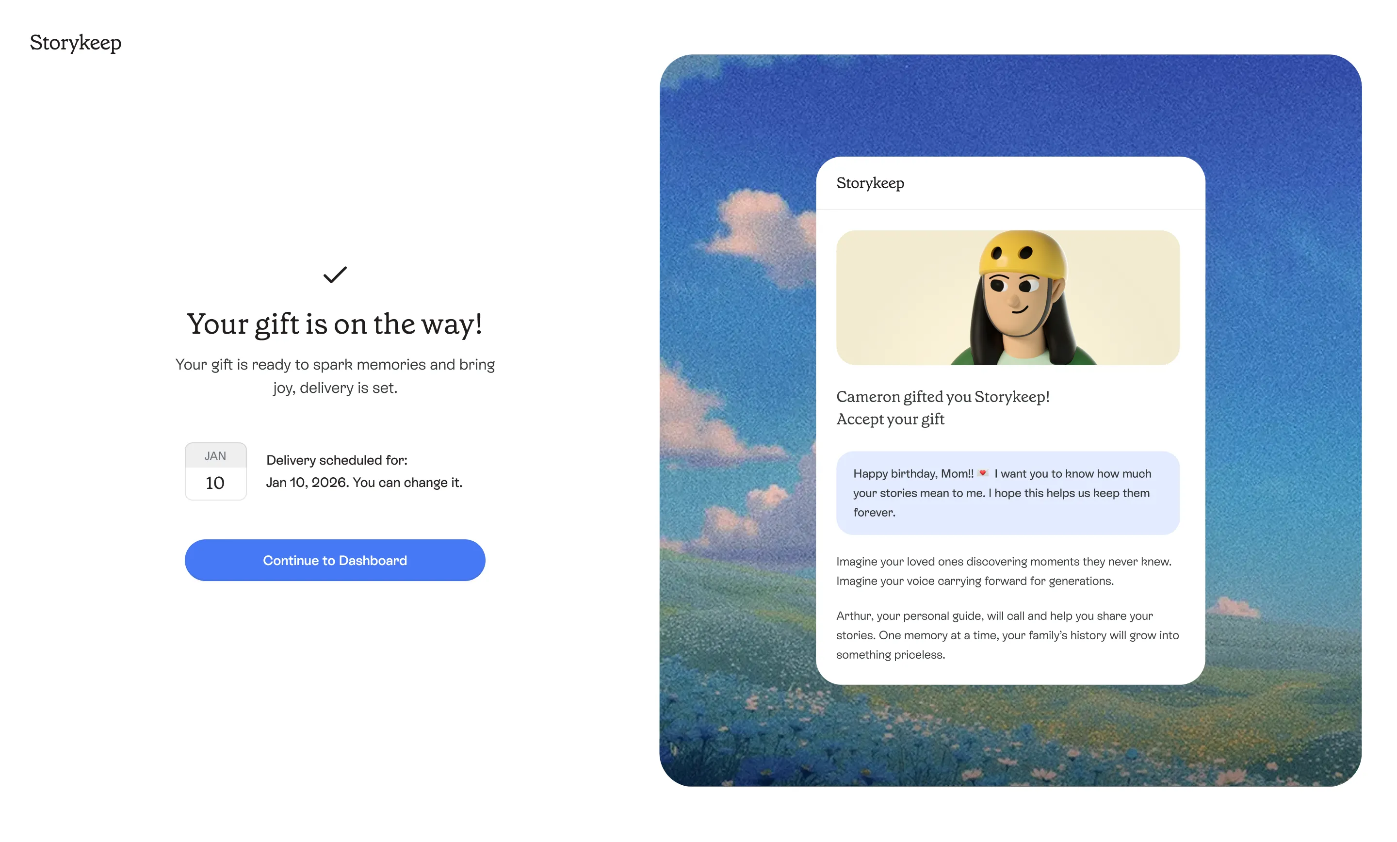
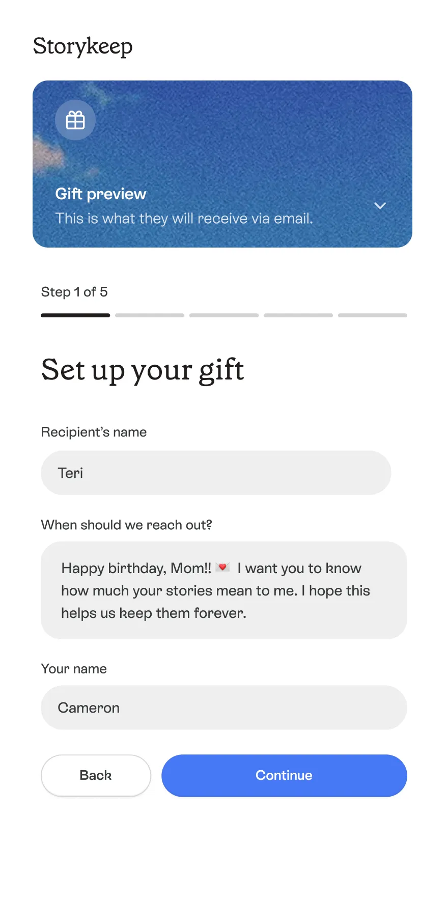
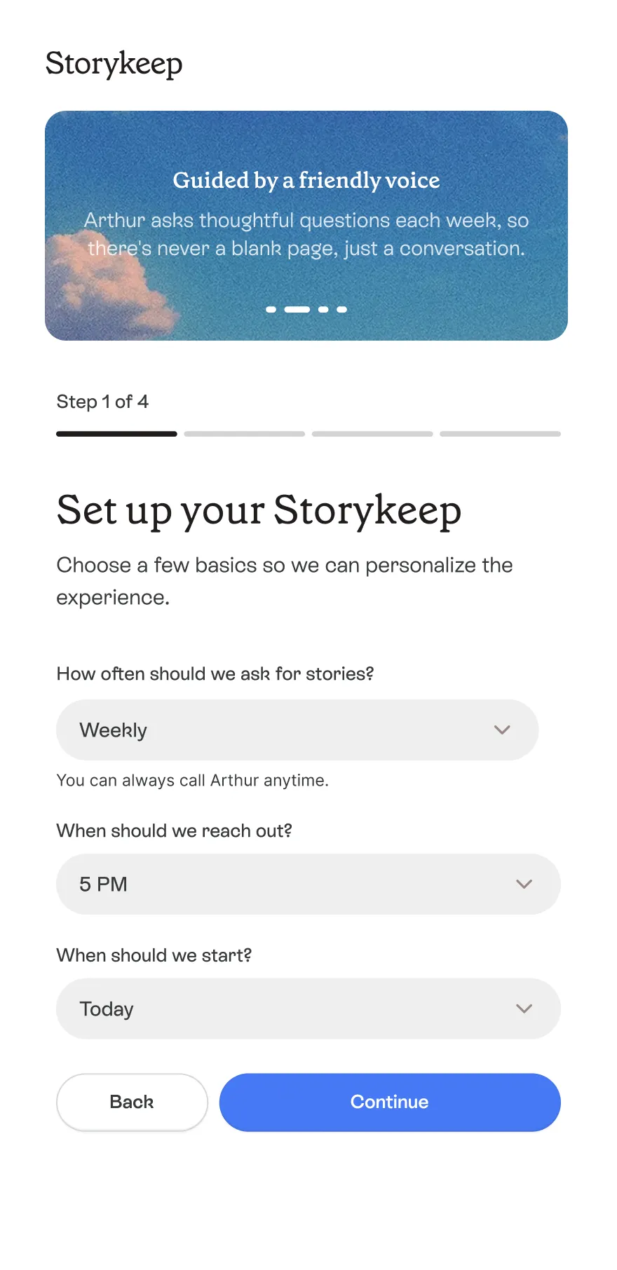
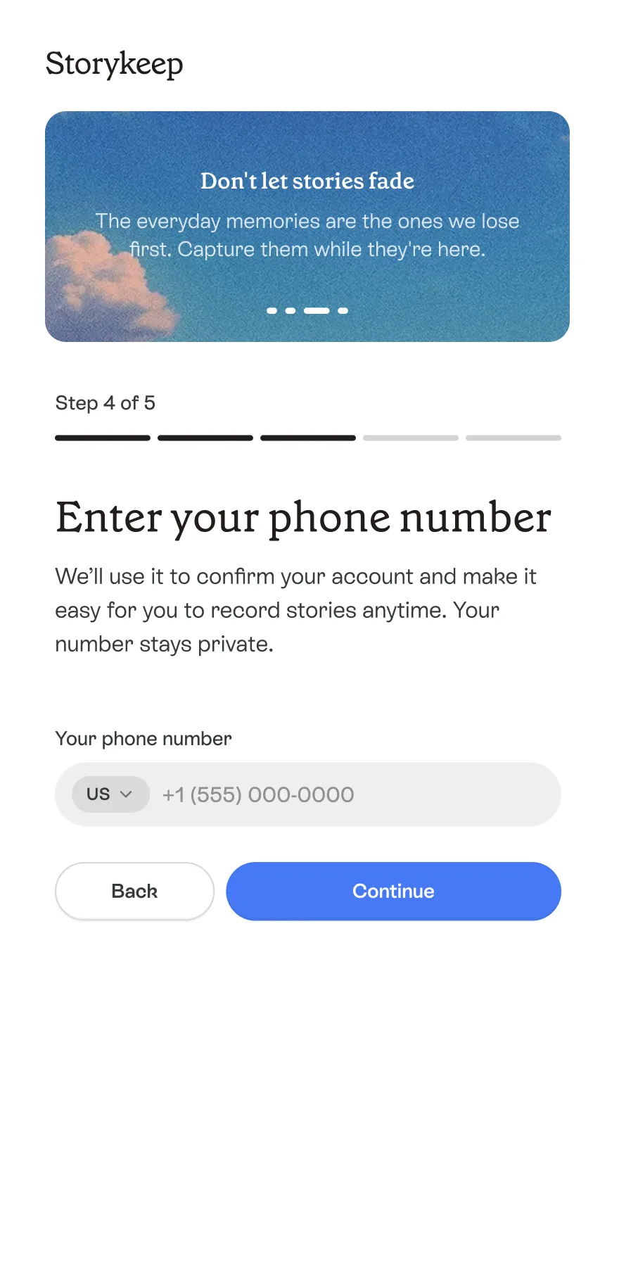
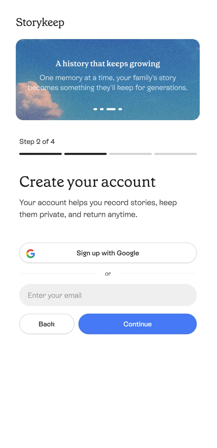
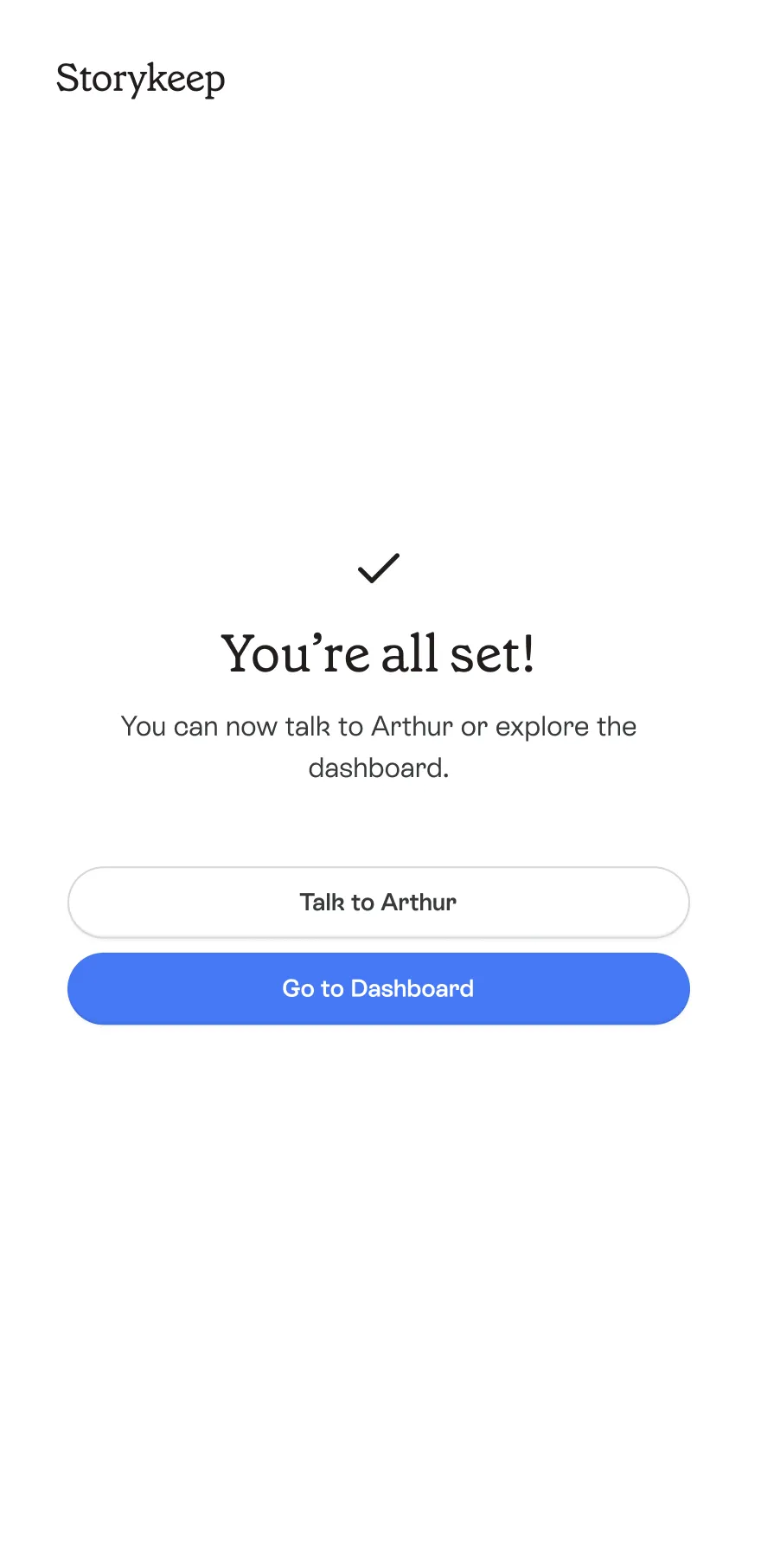
One shared beginning for two different needs
The existing flow asked who Storykeep was for only after phone verification and account creation. People went through the same opening steps regardless of their intention, and some personal details were requested more than once. Other steps could be combined or removed.
With paid acquisition, every person who left registration had already cost the company money to bring in.
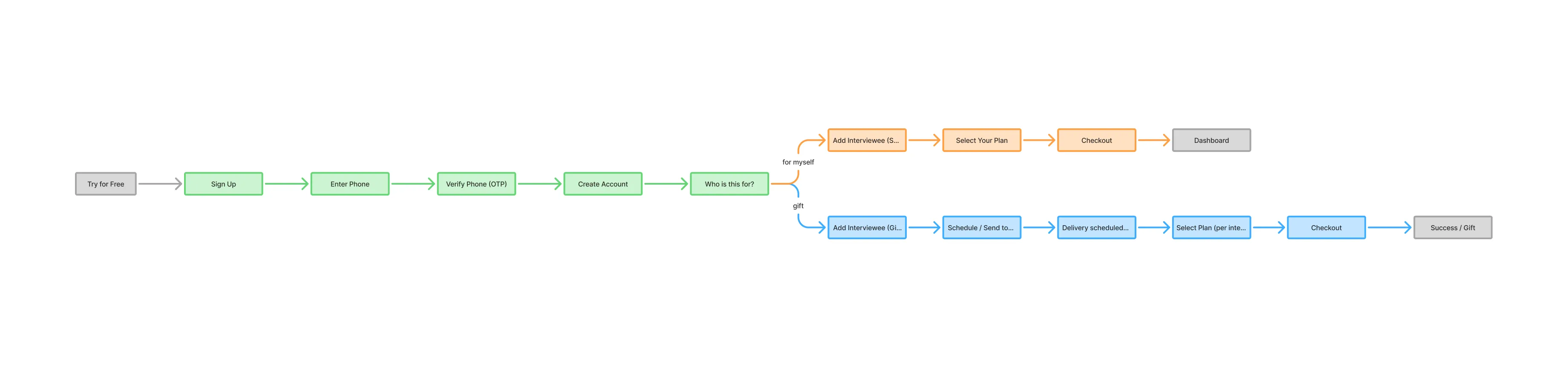
Map the flow before changing the screens
I mapped both paths from entry to completion, looking at when information was requested and where people repeated themselves. That review led to three priorities: identify their intention earlier, put relevant setup before account creation, and remove repeated input.
I proposed the revised sequence to the founders and designed the screens using the existing UI kit. A few details changed during review, while the overall structure remained. With limited time and budget, we shipped without user interviews or usability testing, relying on the flow review and design hypotheses.
Give each path a clear sequence
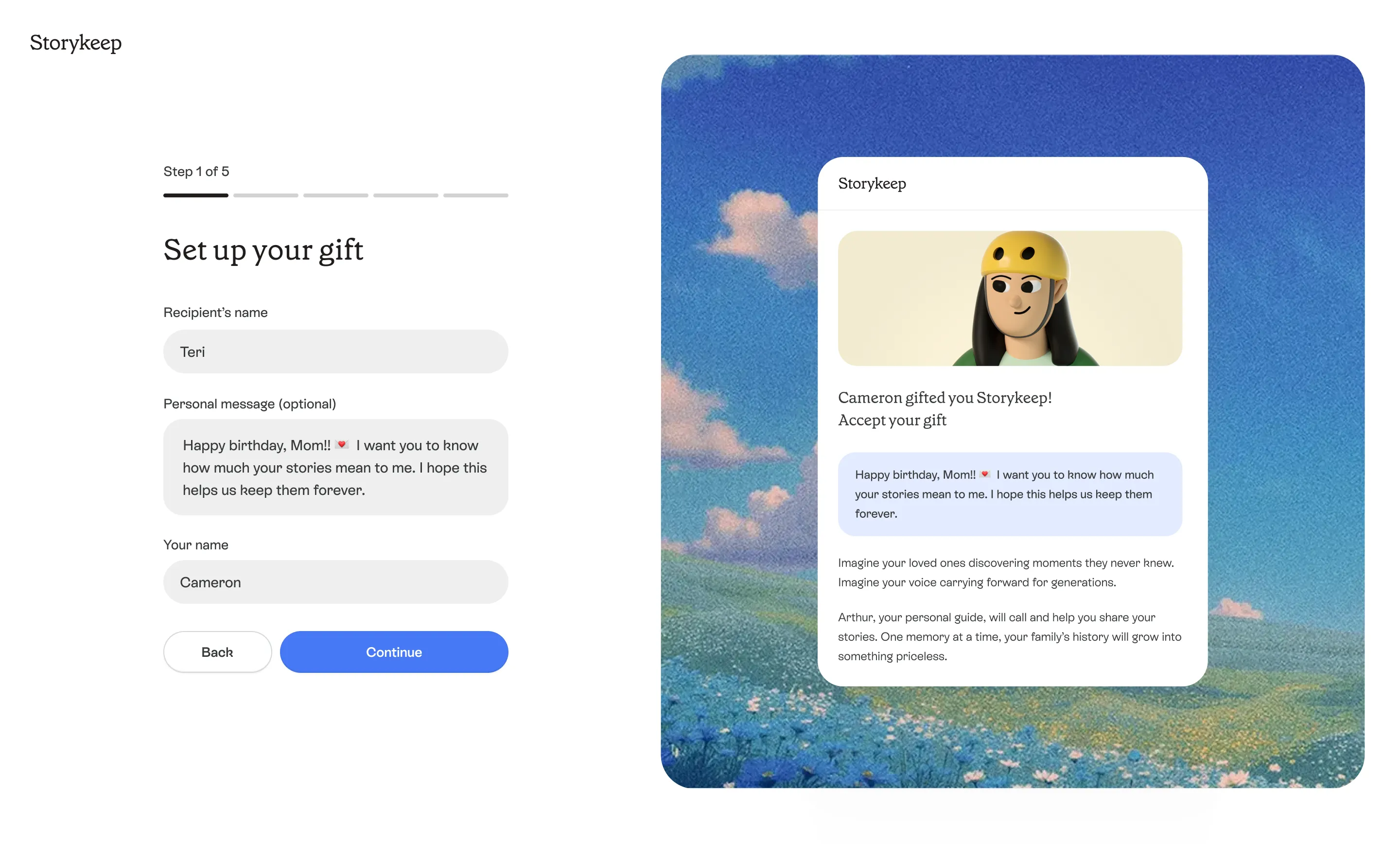
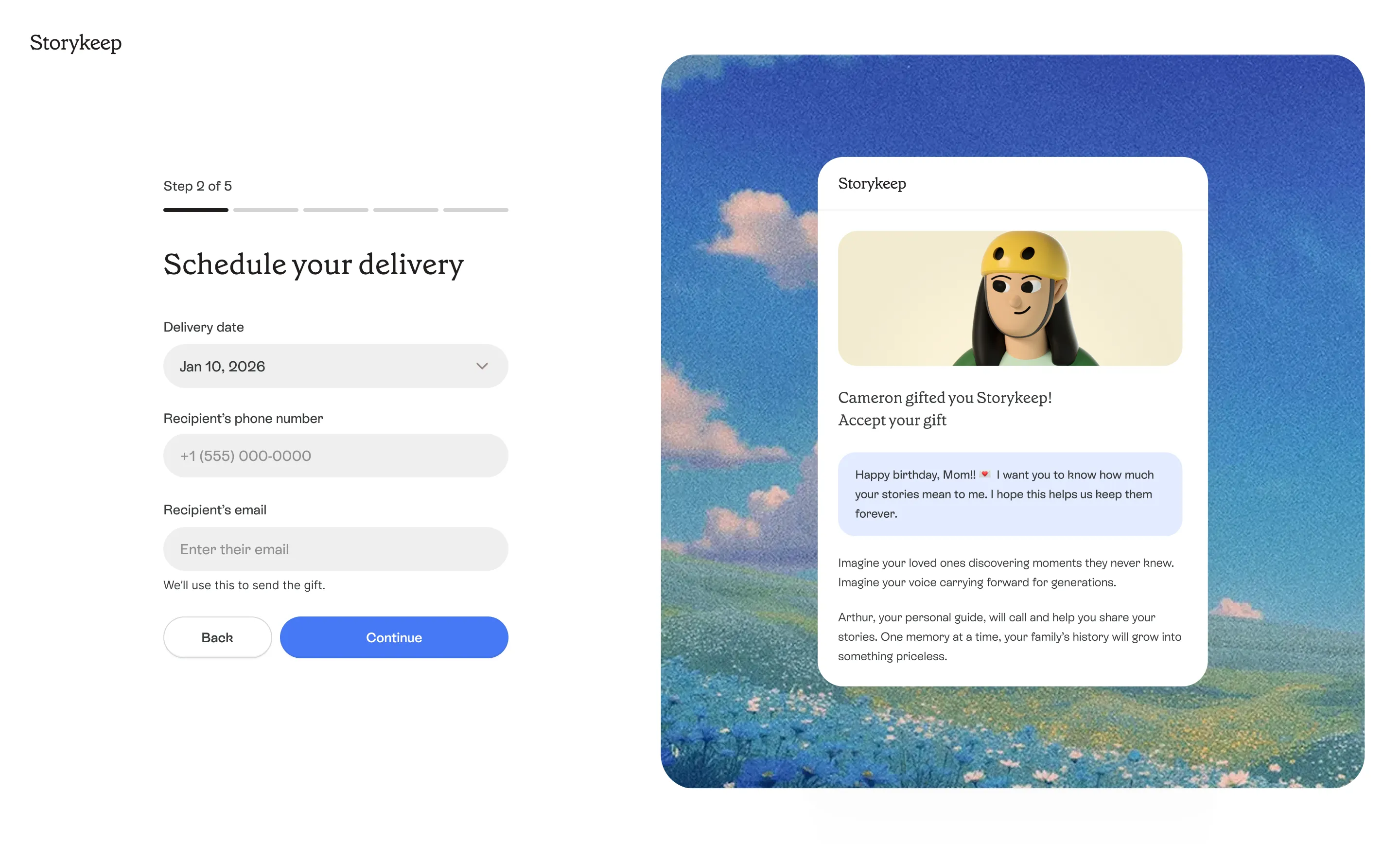
The revised flow starts with who Storykeep is for, then moves into the setup for that path. I brought account creation later and removed repeated requests for personal details. These changes shaped the sequence below; in the gift path, I also added a preview so people could see what they were preparing to send.
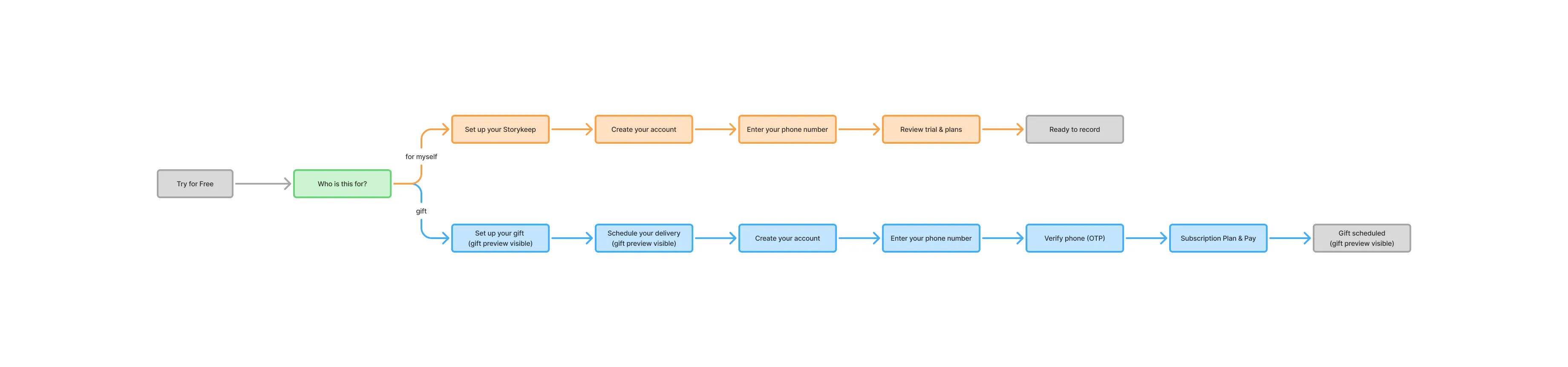
— Choose the path first
“For myself or as a gift” became the first question, so people only saw the setup relevant to them.
— Set up before signing up
People chose their call schedule before creating an account. My hypothesis: having started, they would have a clearer reason to register and save their setup.
— Ask once
I removed repeated requests for personal details. Phone verification stayed, but moved after setup and account creation.
— Preview the gift
A preview showed what the recipient would receive during gift setup and delivery scheduling, helping people understand their purchase before paying.
Completion increased from 12% to 25% in the personal path
The metric covered the journey from clicking “Start recording” on the landing page to reaching the final registration screen in the “for myself” path. The product manager tracked the result: with the traffic source unchanged, completion stayed around 25% for roughly two months, until the next onboarding redesign.
This was the observed result for the redesign as a whole; the contribution of individual changes was not measured separately.
Registration was one milestone. The first story was the next.
The redesign achieved the registration goal, but completing an account was only part of the experience. For Storykeep, the more meaningful milestone was the first call: the moment someone actually recorded a story. The final screen offered a way to talk to Arthur, but our success metric stopped before that conversation happened.
We worked on activation later as a separate task. If I were scoping this today, I would include the journey to the first recorded story from the beginning and measure how many people reached it.